Most of us understand the benefit of cutting words. From our menus to our content, being careful about words pays off in a big way. But what about cutting images? Many site managers are hesitant to give them the axe. But we think you should consider images as part of your next content audit!
Here are some arguments we've heard:
- I need lots of images to make a beautiful website.
- If I'm following accessibility requirements, there's nothing wrong with having decorative images.
- Too much text on a website is bad. If I break it up with images, it's more approachable.
- Our website is part of our brand. And we need images to convey our brand!
These statements are more fiction than fact. I'll dive into each one to debunk the myth and provide a better rule of thumb.
Myth: I need lots of images to make a great website
Some websites are very successful when their content is primarily based on images. On ecommerce websites, for example, the appearance of an item and the ability to see detailed photos are key to the shopping process. Instagram is another example of a site where the primary mode of consumption is visual.
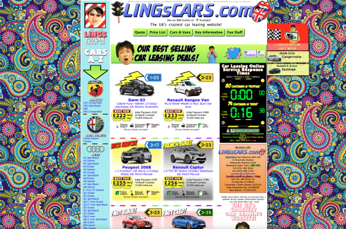
But the use of photos alone isn't what makes sites beautiful or successful. There are plenty of Instagram accounts that don't succeed - because the photos aren't attractive or relevant, or because they're not promoted well, for example. Similarly, there are plenty of sites that are ugly in spite of having numerous images. Ling's Cars is a famous example of this:
In contrast, here's Harvard's very successful homepage:
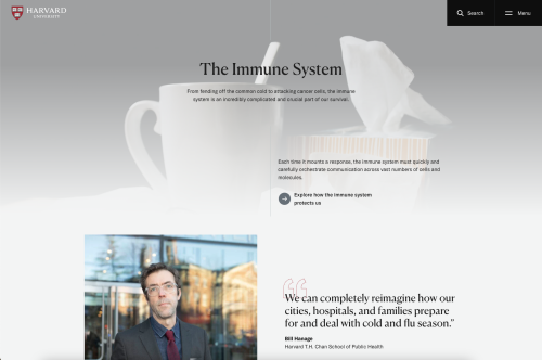
If we compare these two examples, we can see a few clues about why Harvard's site feels more pleasant than Ling's. In the Harvard homepage:
- Although the content is image-based, the site uses a relatively small number of images
- The images are part of a clear visual hierarchy - the images pull your eye along a single, linear path from top to bottom
- The layout includes ample negative space (empty space that makes a layout feel less chaotic and makes distinctions between "chunks" of content easier to see)
You may also notice that the supporting text is concise and formatted to help you understand what each piece of text is. Even without reading the page, we can easily recognize the page title, the subtitle, a call to action, and a quote.
Reality: The layout is what makes a site (and its images) look good.
Myth: There's nothing wrong with decorative images
Harvard's website appears to be "decorated" with images. But in fact, each one serves a purpose: the top image supports our understanding of the page's theme; the second image shows us the expert whose quote is listed. Couldn't we argue that all images serve a dual purpose - decorative and informational?
Perhaps we could say that images are purely decorative when they don't enhance the user experience. For example, the images in the layout below are too large and generic to help with forming a mental model of the content. They just make the page long:
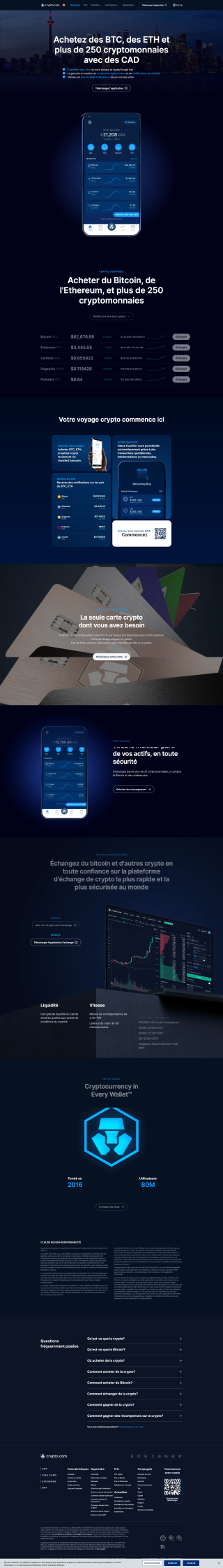
Users of this site have a goal to accomplish: evaluate whether Crypto.com's app is worth their time. They don't benefit from seeing the same larger-than-life image of a phone twice, nor do they benefit from a full-screen view of what credit cards look like. But they would benefit from a clearer summary of what you can do in the app, how secure it is, and how much effort it is to set up. A layout with more structure and fewer images would support their goal better.
In general, images can be annoying when they:
- Get in the way of finding content
- Make users wait for a page to load
- Make screen reading and mobile browsing even harder than they already are
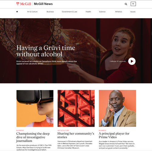
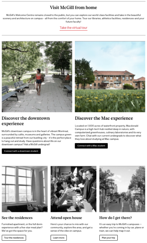
In contrast, here's a layout where users benefit from having images:

In this example, the images aren't essential to understand the content. But prospective students who use this site told us that in addition to getting information, they wanted a sense of what life is like at McGill. By using real photography and trying to match it intelligently with the content, we help users meet both goals.
Reality: Useful images enhance a site. Decorative images waste people's time, energy, and attention.
Myth: Too much text is bad. Adding images makes it better.
This is a gross oversimplification. True, an unbroken wall of text isn't fun to read. For example, this layout is a wall of text:

But even if we sprinkled some images in there, it wouldn't be easy to read. It would just be longer!
What we really need here is chunking and formatting. For example, this layout has just one image and a lot of text. But it still feels friendly:

This layout feels approachable because it has comfortably sized "chunks" of text, uses different font styles to communicate visual hierarchy (making it easy to scan), and has ample negative space around each chunk. This layout also uses plain, concise language so that the text is truly easy to read.
Reality: Lengthy, unformatted text is bad. Editing and formatting it make it better.
Myth: I need lots of images to "brand" my site
There's so much more to branding than the quantity of images! The Harvard homepage, Undergraduate Admissions site, and "Reasons to love studying in Montreal" page are all strong designs that support a brand. Each example has a different image strategy that's adapted to the nature of the content and needs of their users.
Although their use of images differ, all of these examples:
- Focus on image quality rather than quantity
- Use images to support user needs (and don't let them get in the way!)
- Use chunking, negative space and text formatting options to break up content-heavy pages
- Leverage plain language to make sure key messages are clear
These are strategies you can use to amplify your brand, too!
Reality: Images can help brand your site, but they're only one ingredient.
How to use images better
Now you know that you can make an attractive, user-friendly site without tons of images. But you also know that your your users may benefit from some well-chosen images. So how do you choose well? First, do your homework: the "how to get started" section of our Digital Design Toolkit can help you draft user-centric layouts for your images to live in.
Then you can consider your image strategy! I've rounded up some of my favorite ideas to help you find a strategy that makes your images a perfect fit for your site.
1. Use illustrations
Illustrations can create a mood more powerfully than images, because they can leverage colors, compositions, and proportions not found in real life. (You can also use icons, which are basically simple illustrations meant to be used at small sizes.)
Here are three great ways to use illustrations:
To unify groups

Matching illustrations are a great way to visually connect steps in a process or items in a group.
To represent ideas

Illustrations are a great option to support content about ideas, emotions, or other un-photographable subjects.
To build a brand

Illustrations can be customized by using repeating elements (like shapes, colors, or illustration style) across images, giving a sense of cohesion.
2. Choose a theme or style
Choosing and/or remixing a repeating element helps elevate your imagery, making each image feel like it belongs to your site. Repeating elements are also a great way to highlight your brand values. You can do this with illustrations (as seen above) or with photography.
Here are three ideas to try:
Pick a color
In this example, we designed a site that relied heavily on stock photography combined with real-life portraiture. Orange tones in every photo tied them together, even though the photo subjects and compositions were different in each story.
Pick a theme
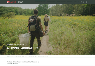

On the Gault site, the main image in every section of the site is an outdoor shot that shows the expansive natural environment. They could've used archival or interior shots for some sections. But by consistently using outdoor photography, they emphasize the natural setting and position it as an integral part of everything they do.
Pick a style
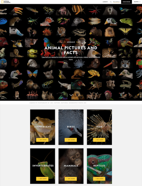
All the animals in this National Geographic series are photographed the same way: close-up and isolated on a black background. This creates a visual signature for the "Animal Pictures and Facts" series, making it look polished and cohesive. This approach also puts the spotlight on the content. When all other variables - the lighting, the background, the cropping - are standardized, the uniqueness of each animal really shines.
3. Pay attention to cropping and composition
Speaking of cropping, did you know that cropping an image can totally change how it feels in a layout?
Use cropping to set a mood
Here are two different layouts that use the same image. In the first version, the image is reproduced in its entirety - including the border of the photo:
In this version:
- The original shape of the photo is preserved, and helps communicate that it's an archival image.
- We see more of the location - we have a sense of the scale and shape of the building behind them.
- The vertical format takes up very little room and encourages users to focus on the text.
In contrast, this second version is cropped close to the faces of the subjects:
In this version:
- The composition - close up, with two subjects looking straight at the camera - feels more modern.
- We see very little of the location. The focus is on the subjects.
- The horizontal format is very wide (allowing users to focus on the details in the image) but short enough to let us see the beginning of the article below.
These examples show how the way you crop an image can have a profound impact on how it "feels" on the page.
Use cropping to support your layout
The way you crop images can also help create balance and support visual hierarchy in your layouts. In this layout, each row uses a single image size:
Keeping each row consistent helps the layout feel orderly. Most site managers already do this! But using substantially different sizes between the first and second row of images helps reinforce the visual hierarchy - telling users that the first two images are more important and should be "read" first.
Conclusion
Great images are the icing on the cake! But be sure to bake up a user-focused, well-structured, plain language website before you start icing it. When you're ready, leverage illustrations, repeating elements, and cropping to help match the images to your masterpiece.
Resources
Are you ready to level up your website's appearance? Here are some other resources to check out:
- The Designing Digital Experiences with the McGill Brand course is a deep dive into how to make better aesthetic choices (and more user-friendly designs)! It's great for WMS site managers, or anyone looking for inspiration.
- Our Digital Design Toolkit is a companion resource to the course, and includes definitions and examples for many of the design concepts mentioned here.
- We have some ideas of where to find images for your site. Just use them well!
- Need some hands-on help? Consult with our team for personalized recommendations.
In a previous version of this article, an example of a McGill website was published in error. There was no intention to disparage the unit concerned, and we regret this error.