
Just as the University is evolving, the communications world is getting more complicated, with new options seeming to pop up every day. The visual identity standards outlined here were developed by the Office of Communications and Institutional Relations, in conjunction with collaborators across the University, to assist McGill faculty and staff in using the various elements of the University’s visual identity consistently. While this document attempts to be comprehensive, we understand that needs are diverse and ever-changing and encourage you to logo.communications [at] mcgill.ca (contact us) with any questions or particular requirements you may have.
What is a visual identity?
It includes, but is not limited to, an organization’s:
- Name, when it appears in writing;
- Official logo and other visual symbols and iconic images traditionally associated with the organization;
- Official colours and secondary palettes;
- Official typography;
- Recognized templates for publications, websites and other communications materials;
- Quality photography and effective graphics and layouts.
McGill’s visual symbols have historic significance and are well-known, making the University’s visual identity an important tool in communicating not only to the University community and to alumni, but also to the larger public.
The importance of consistency
Research shows that effective communications materials; print, electronic or web-based, send a clear and consistent message both through words – and look and feel. If we always use the McGill visual identity and adhere to mutually accepted standards, we are helping to build and enhance McGill’s reputation worldwide.
Consistent visual identity is important for a number of reasons, including:
- It reinforces identity.
- It enhances visibility for the University.
- It enhances the impression of a cohesive and focused institution.
- It results in communications that look more professional.
- It serves as a unifying force for members of our diverse community.
A balance between consistency and creativity
While the use of McGill’s official logo should adhere to strict standards, there is room for creativity, for example through a choice of typefaces and the pairing of official colours with complementary secondary colour palettes. Also, templates for specific communications materials provide for more than one option and will evolve over time. The logo standards and other design tools have been developed to help you communicate effectively with the wide range of audiences that the University addresses.
Use by third partiesThe University’s logo and related elements are registered trademarks. Their use by third parties* – any person or organization other than those employed by the University or acting as its agent – is thus prohibited, except where written authorization has been obtained from the logo.communications [at] mcgill.ca (Office of Communications and Institutional Relations) or where the University has entered into a written agreement permitting such use. Faculty and staff shall refrain from encouraging use of the trademarks by third parties unless specific approval has been obtained. |
The McGill logo
The University logo is a trademark composed of two basic elements – the shield icon and the wordmark. The following pages illustrate the elements associated with the logo, their relationship to each other, proper and improper usage and special applications.
- Logo elements and coat of arms
- Space and size
- Applications principles
- Logo extensions
- Other logos
- Special applications
- Use of other McGill symbols
Logo elements and coat of arms
Logo elements![]()
The shield’s shape and main elements – in particular the martlets – are a strong and familiar visual. The three red martlets on a silver background (white, for the University’s purposes) are taken from the arms of the family of James McGill, the founder of the University. The open book at the top of the shield is the heraldic symbol of an institution of learning. The book bears the words In Domino Confido (“I trust in the Lord”) which was the motto used by James McGill. Two crowns, one on either side of the book, refer to Montreal’s royal name and are composed of fleur de lys as a reminder of the city’s French origin. Montreal’s three hills are represented by three peaks above the martlets.
The wordmark “McGill” is custom-designed, meaning the six letters – based on the Garamond typeface – have been designed as a single image and cannot be typed as a word.
It is not possible to reproduce the wordmark with standard printing typefaces and other typefaces may not be substituted.
Except in rare circumstances, it is always required to use the full logo rather than one or the other of its parts.
Coat of arms

The McGill coat of arms consists of two parts, the shield and the scroll. It is reserved for special circumstances and should not be used as a substitute for the logo. The coat of arms is derived from an armorial device assumed by James McGill. The University’s patent of arms was granted by England’s Garter-King-at-Arms in 1922 and registered in 1956 with Lord Lyon King of Arms in Edinburgh and in 1992 with the Public Register of Arms, Flags and Badges of Canada. In heraldic terms, the coat of arms is described as follows: “Argent three Martlets Gules, on a chief dancette of the second, an open book proper garnished or bearing the legend In Domino Confido in letters Sable between two crowns of the first."
Motto: Grandescunt Aucta Labore (‘By work all things increase and grow’).
Space and size
Proportion and vital space
![]() The McGill logo has been designed with specific proportions, spacing and alignments that enhance its legibility and impact. These are reflected in all official logo files.
The McGill logo has been designed with specific proportions, spacing and alignments that enhance its legibility and impact. These are reflected in all official logo files.
The main unit of measurement for spacing used in this manual is based on half the width of the shield (or .5x).
The logo, shield, Coat of Arms, wordmark and brand extensions should be surrounded by at least .5x vital space to ensure their integrity and clarity and separate them from any other text or graphic elements.
Regardless of the logo’s size, the proportions remain the same.
Minimum size
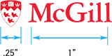 The shield should never be reproduced under .25 inches in width. In general, the wordmark should not be reproduced under 1 inch with the exception of certain special applications (see Special Applications). Remember, except in rare circumstances, it is always required to use the full logo rather than one or the other of its parts.
Applications principles
Black version
![]() The logo can be used in black when it is used in monochrome and duotone projects where the use of red is not possible. Whenever possible, the red version is preferred.
The logo can be used in black when it is used in monochrome and duotone projects where the use of red is not possible. Whenever possible, the red version is preferred.
![]()
Reverse version
When the logo is printed on McGill red or a dark background, the reverse version of the McGill signature should be used. As seen on the right, the wordmark becomes white but the colours of the shield stay the same with only a white outline added around it. The colours of the shield should not be inverted (i.e. the martlets remain red on white and the crowns and book white on red).
General application principles
 The logo should appear on the front of all printed and digital documents.
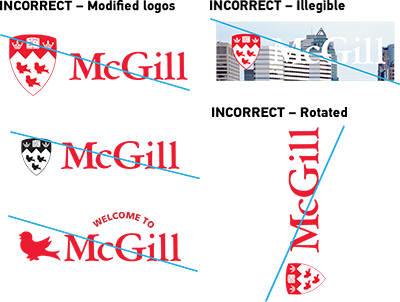
- The shield, wordmark and/or logo must not be modified in any way.
- The shield may never appear in any colour other than McGill red, or black, or – for special, approved, circumstances – silver or gold.
- The logo should always be clearly legible. Avoid overly busy backgrounds.
- The logo must never be used as a headline or set into text as part of a sentence.
- Always maintain vital space around the logo when it is adjacent to other items or the edge of the page.
- The logo should always be used horizontally. It should not be rotated.
- The McGill logo or the individual elements that compose it (shield, martlet, wordmark, etc) cannot be included within another logo (see The McGill Logo: Other logos).
Logo extensions
One-tier extensions
Bilingual
All font and line sizes shown here are relation to the logo at minimum size and should be resized proportionally to the logo. The whole logo can appear in either red, “reversed” or black versions. In the English extension, each word is capitalised. In the French, only the first word and proper nouns are.
The horizontal option uses a black divider line of 0.5 pt thickness and 0.36” height (equivalent to 3 lines of text – see One-tier extensions (longer unit names). The extension text block is centred vertically along the height of the M in McGill.
For the vertical version, there is no divider line and the extension text block is aligned with left stem of
the M.
Although both horizontal and vertical options are available, the horizontal one is preferred.
![]()
With prepositions
Both lines are typeset in McGill Sans Medium. In English, the preposition stays on the first line but in French it goes on the second one.
![]()
Longer unit names
A three-line logo extension is the maximum.
![]()
Unilingual
As with the bilingual version, the horizontal option is preferred.
![]()
Two-tier extensions
Unilingual
The subordinate unit’s name is set in McGill Sans Medium. It must not be longer than three lines.
![]()
Bilingual horizontal
The English and French main unit names are placed side-by-side to the right of McGill (same as in the one-tier horizontal option) and the subordinate units are placed 2 pts below. The subordinate units are set in McGill Sans Medium.
![]()
Bilingual vertical
The English and French main unit names are placed side-by-side under McGill (same as in the one-tier vertical option) and the subordinate units are placed 2 pts below. The subordinate units are set in McGill Sans Medium.![]()
Special logo extensions
Here are two currently recognized special logo extensions.
It is not possible to reproduce these extensions with standard typefaces.
![]() "University"
"University"
The words ‘University’ and ‘Université’ can be displayed as shown but are only to be used in cases where it is deemed that the logo by itself may not be sufficient to clearly identify McGill as an educational institution.
![]() Macdonald Campus
Macdonald Campus
In efforts to better integrate both campuses, the Macdonald Campus shield with its combination of green and gold is no longer used to separately denote the Macdonald Campus. Instead, the word Macdonald, or the words Macdonald Campus or Campus Macdonald, is/are displayed under the McGill logo, as shown. The Macdonald shield may be used only under special circumstances.
Improper extensions
![]() DO NOT
DO NOT
- Mix type weights on the same line.
- Use McGill Sans Medium for anything other than a unit designation e.g. ‘Faculty of’ or a two-tier subordinate unit (see Two-tier extensions).
- Use more than three lines max for any logo extension.
Other logos
No academic unit (including its programs) other than one covered by the Policy Relating to the Naming of University Assets may develop a secondary logo, see Online Resources.
The University strongly encourages all units to use an extended version of the McGill logo, rather than develop their own separate logo. Secondary logos may be used only with approval from the logo.communications [at] mcgill.ca (Office of Communications and Institutional Relations) and only in conjunction with the McGill logo. If you are planning to use an image consistently, e.g. for a recurring event, consideration should be given to visual identity issues, whether or not the image constitutes an official logo.
Named faculties
![]() The University’s named faculties (Desautels Faculty of Management and Schulich School of Music) have, with permission, created their own logos for which separate standards have been developed. Both logos are used in conjunction with the McGill logo. For further information about the branding guidelines of these particular faculties, please contact their communications offices.
The University’s named faculties (Desautels Faculty of Management and Schulich School of Music) have, with permission, created their own logos for which separate standards have been developed. Both logos are used in conjunction with the McGill logo. For further information about the branding guidelines of these particular faculties, please contact their communications offices.
Named schools
![]() A few University schools are also named after a donor, like the Max Bell School of Public Policy. In cases where they have their own logo, the latter is placed in a similar manner to faculty names, that is, to the right of the McGill logo and separated by a vertical line not closer than half the shield. The vertical line’s height can vary according to the school’s logo. Care should be taken to balance the school’s and McGill's logo so that neither dominates the other visually.
A few University schools are also named after a donor, like the Max Bell School of Public Policy. In cases where they have their own logo, the latter is placed in a similar manner to faculty names, that is, to the right of the McGill logo and separated by a vertical line not closer than half the shield. The vertical line’s height can vary according to the school’s logo. Care should be taken to balance the school’s and McGill's logo so that neither dominates the other visually.
Other approved logo
![]() The University has given permission to use a variation of the logo in the following case:
The University has given permission to use a variation of the logo in the following case:
McGill Athletics and Recreation
This logo may be used on sports equipment and promotional items. It is to be used solely by Athletics and Recreation, in accordance with standards created for its use.
New secondary logos
 Units seeking to create a secondary logo must request permission from the logo.communications [at] mcgill.ca (Office of Communications and Institutional Relations) and must work with its Graphic Design unit which will ensure that any secondary logo harmonizes with McGill visual identity standards. Graphic Design can also provide instruction as to how secondary logos may be used.
Unless approved by the logo.communications [at] mcgill.ca (Office of Communications and Institutional Relations), the McGill logo or the individual elements that compose it (shield, martlet, wordmark, logo) CANNOT be included within the new logo.
Pairing a secondary logo with the McGill logo
![]() If pairing a secondary logo with McGill’s, the only accepted placement is to position the secondary logo to the right of McGill’s, separated by a black divider line, with half the width of the crest between each element, similar to extension names (see The McGill logo: Logo extensions). The secondary logo can also be placed separately from the McGill logo, but the latter must then appear prominently elsewhere on the same page. Care should be taken to balance the secondary logo and McGill’s so that neither visually dominates the other.
If pairing a secondary logo with McGill’s, the only accepted placement is to position the secondary logo to the right of McGill’s, separated by a black divider line, with half the width of the crest between each element, similar to extension names (see The McGill logo: Logo extensions). The secondary logo can also be placed separately from the McGill logo, but the latter must then appear prominently elsewhere on the same page. Care should be taken to balance the secondary logo and McGill’s so that neither visually dominates the other.
Special applications
![]() Logo on other materials
Logo on other materials
Special artwork must be used when the logo appears on materials such as glass and metal. The martlets should never appear white on a dark background.
Please contact Graphic Design for special cases and artwork requests.
Other special applications
Large FormatsWhen producing special types of communications, such as banners, signs or items where the size of type must be visible from a distance, type can be placed with the logo as long as vital areas are respected.
![]()
Small Formats
![]() For very small applications, the shield may be dropped from the logo and the wordmark may be reduced to fit. Vital space should be respected if possible.
For very small applications, the shield may be dropped from the logo and the wordmark may be reduced to fit. Vital space should be respected if possible.
Use of other McGill symbols
![]() Martlet icon
Martlet icon
The red bird called a martlet is one of McGill’s most recognizable symbols. Martlets can be used as added elements on brochures, newsletters or any university collateral. The martlet has no feet and thus always appears in flight.
Approval by the logo.communications [at] mcgill.ca (Office of Communications and Institutional Relations) is required should you wish to use a martlet as a design element.
Visual system
The University’s visual system is used to implement the brand across various media. Official colours, typefaces and visual elements are important in creating a visually consistent graphic look and feel, and ensuring a unified and strong brand.
Colour palette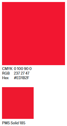
One rule for colour: Use McGill Red
McGill Red is our colour to own. As long as McGill Red is incorporated into our layouts (alongside the McGill logo), we can be free to choose the rest of our palette.
Colour is a strong identifier and using the distinctive McGill Red will ensure connection across communications whether we are using type, illustration, photography or pattern for our communications.
McGill Red
McGill red is CMYK 0 100 90 0.
For electronic display, the RGB (red, green and blue) value is: R237, G27, B47 or Hexadecimal value #ed1b2f.
Pantone Solid 185 is used when printing in one or two colours.
Secondary colours
McGill’s secondary colours, are not official but rather suggested colours that cover a larger spectrum to complement the McGill red. They can be used to add variety and contrast for headings, bullets, background and other graphic elements.
|
Pastels |
Brights |
Muted |
Darks |
Black & |
Cool Grey |
|---|---|---|---|---|---|
|
|
|
|
|
|
|
|
|
|
|
|
|
|
|
|
|
|
|
|
|
|
|
|
|
|
|
|
||
|
|
|
|
||
|
|
|
|
|


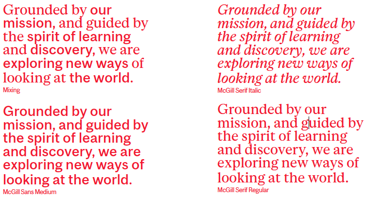
Typography
One rule for type: Use McGill typeface
The University has its own unique typeface with both serif and sans serif that have been designed to use interchangeably. It is a flexible face that has been created for use in graphics, headlines, body copy, as well as informational needs like diagrams and captions. When used together, they signal the multifaceted spirit and eclecticism of McGill. The McGill Typeface may be downloaded here.

Word, Outlook and PowerPoint typefaces
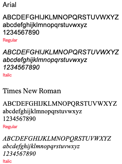
When it is not possible to install the McGill typefaces on the computer and when composing emails, please use the system fonts Arial and Times New Roman as substitutes in Windows and Helvetica and Times in MacOS.
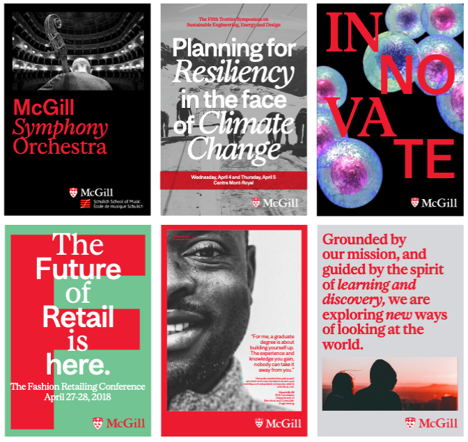
The McGill typeface in application
Lookbook
The visual world
Use of photography
Portraying the beauty of McGill’s campus, the amazing accomplishments of its vibrant community and the small pleasures of everyday life at the University is key to maintaining a strong brand. Here are some best practices for the capture and use of photography:
Copyright
Before using any photo in your publication, ensure that the rights to its use have been obtained and
that proper credit is attributed. The University has a bank of photos that can be used for McGill-related documents. You may also use creative-commons or royalty-free stock images or commission your own photos. You should NOT obtain and use photos from the Internet or other sources if you are unsure about its copyright status.
Quality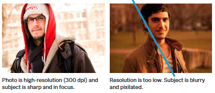
To avoid pixilation, ensure that all images are of high quality, at least a resolution of 72 dpi for web and 300 dpi for print.
Style
It is best if your photos represent real McGill people and locations. However, when this is not possible, the use of stock photography is fine if it matches the University’s overall branding and positioning. Avoid very cliché and generic shots and favour authenticity, honesty and originality.
Subjects
Subjects in photographs should appear natural and spontaneous, rather than heavily staged or posed. While shooting portraits, subjects should convey confidence and ease. Avoid corporate logos, very busy or potentially offensive graphics on the subject’s clothes or props they are holding.
Framing and composition
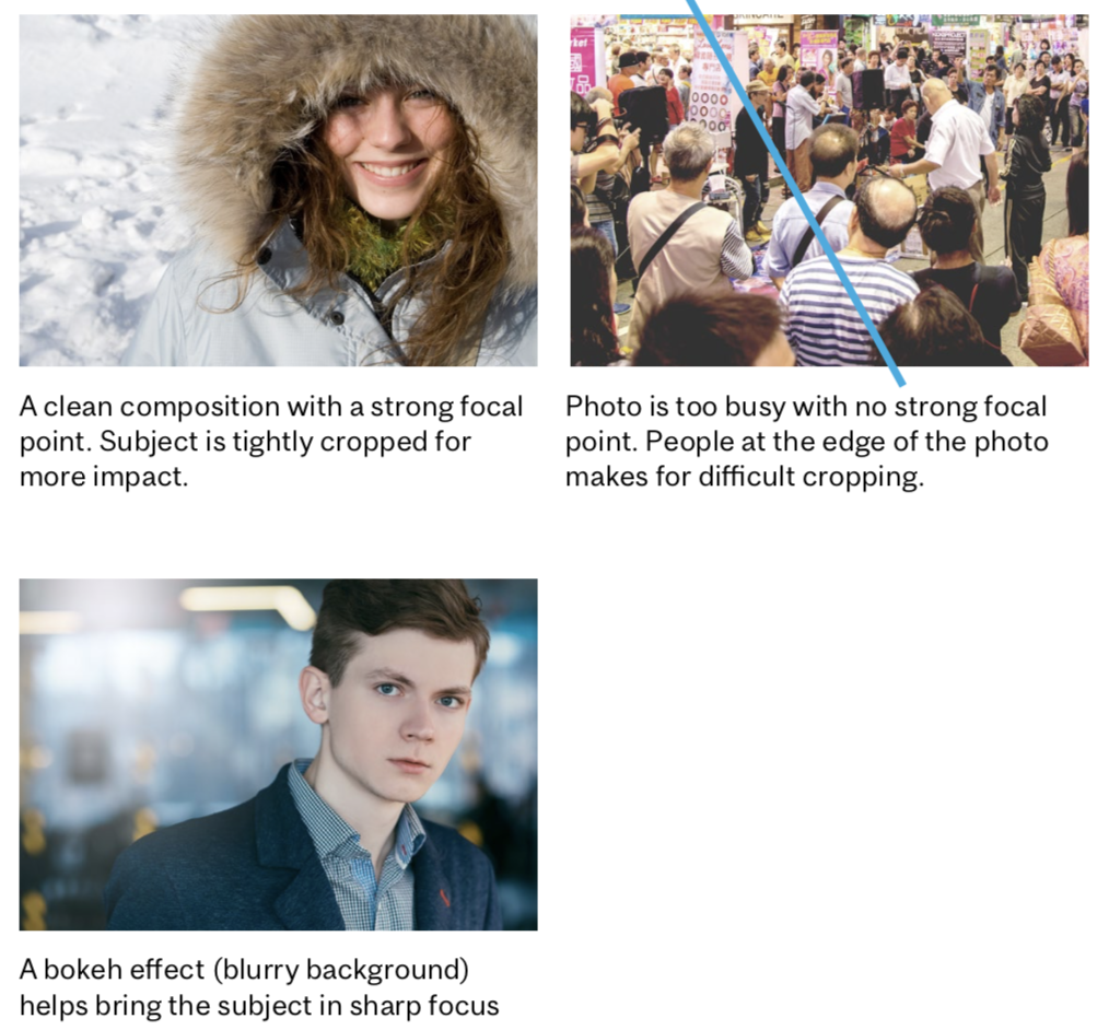 Photographs should be framed to lead the eye towards one focal point. This could be a person, object or place. For a more dramatic effect, consider using close-ups and tighter framing during the design phase rather than when capturing the picture to allow for more flexibility.
Avoid very cluttered backgrounds. A bokeh effect, where the background is blurred out, can help in isolating and focusing on the main subject.
While capturing action, include the context in the frame to provide relevant information to viewers.
Contrast and lighting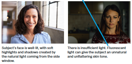
Capture photos with unfiltered colours and natural contrast for a true-to-life representation of the McGill story.
For portraits, make sure the subject’s face is well lit, favouring soft contrast and avoiding harsh shadows. Use of a flash is recommended when shooting indoors and when there is insufficient natural light.
You may contact The Office of Communications and Institutional Relations for information about the shared photo bank or questions regarding photo credits.
Made platform
Made by McGill is our creative brand platform
We use it for recruitment and fundraising, among other marketing initiatives.

Visual overview
In this stream of brand and campaign communications, consistency is crucial to making an impact at scale.

Tools
We incorporate McGill Red and specific McGill typefaces for Made by McGill communications, along with a distinct mark and photography style.
Colour palette

CMYK 0 100 90 0
RGB 237 27 47
HEX #ED1B2F
PMS Solid 185

CMYK 60 40 40 100
RGB 0 0 0
HEX #000000
PMS Black C

CMYK 15 11 10 0
RGB 215 215 217
HEX #D7D7D9
PMS 427 C

CMYK 0 0 0 0
RGB 0 0 0 0
HEX #FFFFFF
White
Font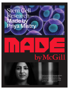
The McGill typeface is used on all Made by McGill collateral. This example shows how McGill Sans and Serif are designed to live together in a headline.
Photography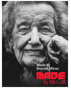
Made by McGill photography ranges from Portraits, Places, Story and Metaphoric themes. This example is a portrait of McGill Professor, Brenda Milner.
Stationery system
The University stationery includes both printed and electronic letterhead, business cards, envelopes, memos, fax sheets, notepads, and e-mail signatures. The samples shown here present the maximum amount of information that would likely be included. Most cases should have less information to display and therefore appear less crowded. All information is printed in black or McGill red. McGill Printing Services is the official supplier of McGill letterhead and stationery. Printing Services can also provide units with electronic versions of their letterhead. Units are encouraged to work with Graphic Design should they have more customized stationery needs.
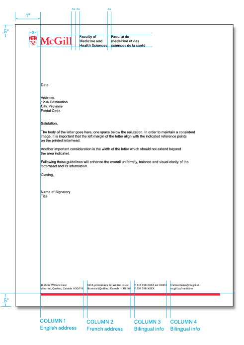
Letterhead
Official University letterhead, both printed and electronic, is disseminated around the world. Although e-mail is now the more common form of correspondence, much of our official communication is still sent via printed letterhead. It is therefore important that the information on all McGill letterhead be organized and well presented.
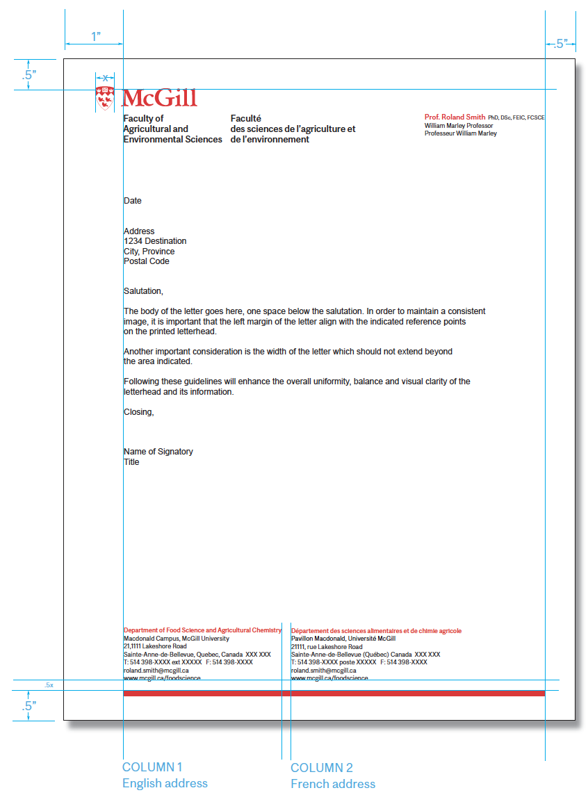
Standard bilingual style
All letterhead used by the University should be bilingual. The standard letterhead is as shown. A unit name can appear as a standard logo extension and/or at the bottom.
Format: 8.5” x11”
Faculty name: McGill Sans Medium – 10.25/12.5 pts
Name of person: McGill Sans Medium – 8/9.5 pts
Degrees: McGill Sans Regular – 6/9.5 pts
Titles: McGill Sans Regular – 7/9.5 pts
Unit name: McGill Sans Medium – 7/9.5 pts
Address: McGill Sans Regular – 7/9.5 pts
Red line: 7” x .1565”.
McGill Printing Services has templates for all McGill stationery and should be used for typesetting and printing these items.
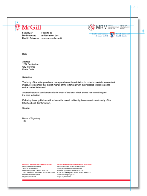
When a McGill entity has an affiliate or partner, the affiliate’s logo should be aligned as shown, in the top right corner. This area has the most space to add other signatures and logos without encroaching on the writing area.
 Electronic letterhead
For customized electronic letterhead, contact Graphic Design.
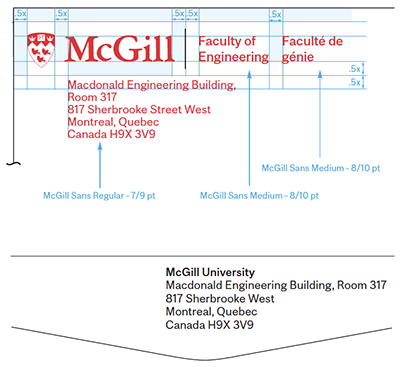
Business cards
Spacing and layout
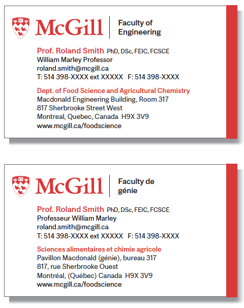
For business cards, names are set in McGill Sans Medium 8/9.5 pt, degrees in McGill Sans Regular 6/9.5 pt, and titles in McGill Sans Regular 7/9.5 pt.
E-mail address and telephone should be written below the name and title. There is an extra +5 point space below the telephone information.
In order to create uniformity and save space, the following symbols are suggested for both English and French:
T: Telephone, C: Mobile devices, F: Fax
The Unit name is set in McGill Sans Medium 7/9.5 pts and the address in Sans Regular 7/9.5 pts.
The McGill business card is bilingual, with each language printed recto verso.
The red line thickness is .0937”.
Approved secondary logos
![]() Approved secondary McGill logos may be added to the right of the black line. The faculty name then moves down after the department name in order to make room for the secondary logo. The logo size must not be larger than the McGill shield.
Approved secondary McGill logos may be added to the right of the black line. The faculty name then moves down after the department name in order to make room for the secondary logo. The logo size must not be larger than the McGill shield.
A McGill business card should not incorporate the logo of an external institution, as this practice incorrectly suggests a formal institutional relationship.
Graduate student
McGill graduate students can obtain business cards through Printing Services, with the authorization of the academic unit where they are registered.
McGill Printing Services has templates for all McGill stationery and should be used for typesetting and printing these items.
Envelopes and labels
 Envelopes
Whatever size the envelope, the McGill logo always appears in the top left corner as shown. The unit extension appears to the right and the return address can either appear below or on the back flap if it is deemed too lengthy.
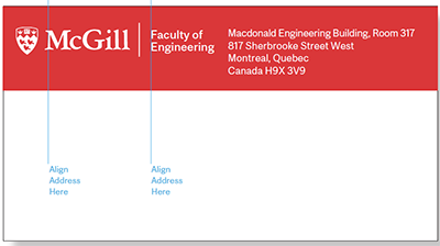 Labels
Mailing labels are used for oversized envelopes and packages. The standard mailing label size represented here is 4.75” x 2.75”. In this example, the logo, extension and address are reversed on a McGill red band.
McGill Printing Services has templates for all McGill stationery and should be used for typesetting and printing these items.
Memo
A University memo template, as shown, is available on the web.

Email signature
English only
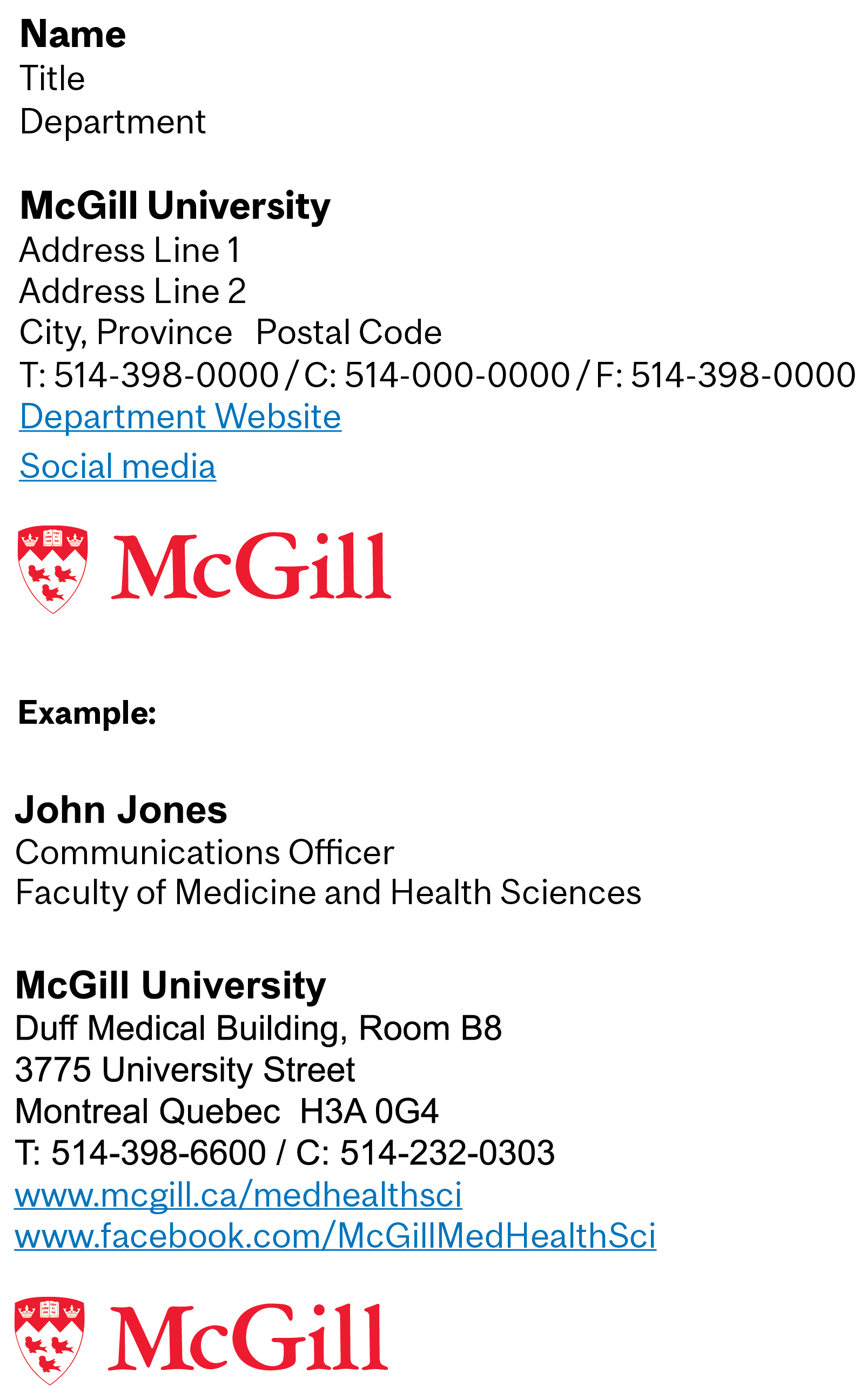 This is the suggested email signature format for administrative and academic units and departments.
On PCs, the typeface is set in Arial. On Macs, please use Helvetica.
Name: Arial Bold, 10pt
Title and department: Arial Regular, 9pt
Use one line break space after the department name.
McGill University: Arial bold, 10 pts
Address: Arial Regular, 9 pts
Office phone, cell phone (optional) and fax (optional): Arial Regular, 9 pts
Department’s website and social media links (optional): Arial Regular, 9 pt, underline, clickable links.
For social media links, if any, it is best to link text instead of icons to avoid visual clutter and conflict with the McGill logo.
It’s best to include the “www” in the web links so that a hyperlink is automatically created in the email program.
The pre-formatted McGill logo for email signatures can be downloaded from the University Visual Identity website.
Bilingual
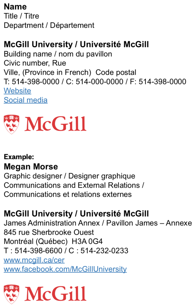 You can also choose to have a bilingual signature. However, for simplicity’s sake we recommend that the address be in French only.
Visual systems: Web
This section covers websites created outside McGill’s WMS. Units are encouraged to work with McGill’s Digital Communications team for support when looking to build a new website.
Colour Palette
 Primary colours – Web
The primary colours of any McGill web property must match the McGill Core Palette.
Websites must use McGill red (#ED1B2F), solid black (#000) and white (#FFF). Neutral (not warm or cool) grays may also be used.
We suggest pale gray (#F4F4F4) as a light background color that complements the core palette.
Medium gray (#D4D4D4) works well for structural accents like horizontal rules.
Websites may use additional colours as long as they are compliant with the Core Palette standards.
Typefaces
 Official typefaces – Web
All new websites and applications should use the McGill typefaces (see: Visual System: Typefaces)
We suggest a minimum size of 16px (or its equivalent) for body copy. Microcopy may be as small as 14px.*
Where the site or application does not accommodate custom fonts, please contact web.communications [at] mcgill.ca (Digital Communications) to determine the appropriate level of compliance.
* You should ensure that the type sizes are appropriate for the text color and background color. Colorable provides an easy resource to see if contrast is sufficient at these sizes. If Colorable says compliance is achieved for "AA large," you'll need to adapt your text size and/or weight to meet accessibility requirements. Learn more about the contrast designations you'll see in Colorable.
Headers and Footers
Use of headers – Web
 In order to maintain consistency across McGill web properties, the header must feature the McGill logo and unit name/identity as described in The McGill Logo: Logo extensions on horizontal logo extensions. Note that the logo and its extension must meet the standard space contrast and black-divider-line requirements.
Aside from respecting general best practices for site navigation schemes, there are no other requirements for the header. Colour, layout and styling can be freely adapted to meet the needs of the sponsoring unit and their audience.
Example of a compliant header:

Use of footers – Web
 McGill web properties should use a standard footer with a black background.
- Header and emphasized text are white
- Links and other text are pale grey (#D7D7D7)
- Horizontal rules and other structural elements are medium gray (#676767)
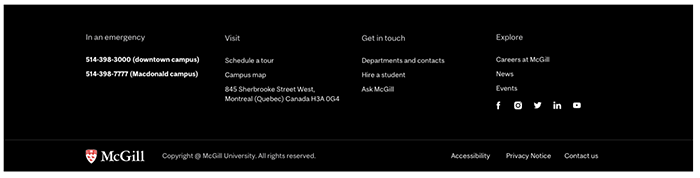
Websites should always include the institutional footer shown below at the very bottom of every page. This contains McGill logo (linked to McGill.ca), copyright notice, and links to accessibility, privacy, and contact information.
Above that, the footer may also include a collection of links that users would expect to find in the footer. This is separated from the institutional footer by a divider line.
If this upper portion contains more than six links, these should be organized into columns.
For code and assets needed to build the standard footer, please contact web.communications [at] mcgill.ca (Digital Communications).
For applications and third-party software with different footer standards, contact web.communications [at] mcgill.ca (Digital Communications) to determine the appropriate level of compliance.
Analytics
![]() Tracking code
Tracking code
McGill has a central Google Analytics installation that includes all McGill-branded and sponsored websites. All new websites must embed the tracking code on the left in order to be included in the central dataset.
Other Considerations
URL standard
All official McGill sites must use a mcgill.ca URL: either sitename.mcgill.ca or mcgill.ca/sitename.
Favicon
 The official McGill favicon is the red martlet as seen on the left. It is available in .png and .ico formats; .ico is preferred. The favicon should be associated with all pages of all McGill-branded sites. The favicon may be obtained by contacting web.communications [at] mcgill.ca (Digital Communications).
![]() Site icons
Site icons
Use of a project-specific, professionally designed icon suite is permitted, provided the icons are used in a way that is accessible and compliant with best practices. Where this isn’t possible, McGill recommends using Google Material Icons: an exhaustive set of scalable and user-friendly icons.
Page credits
The public-facing side of a McGill-branded website should bear no mention of the platform (ex. WordPress, Drupal), vendor, or other service provider implicated in the creation, maintenance, or hosting of the site.
Site titles (as seen in browser tabs)
The title attribute for a homepage should use the format “Site name | McGill University”
The title attribute for internal pages should use the format “Page name - Site name | McGill University.”
Video
This section covers McGill-branded video. Units are encouraged to work with McGill’s Video Production Services when looking to produce original video content.
Captions
Typography
 Wherever possible, official McGill fonts should be used for creating video captions. In most cases, McGill Sans Regular and McGill Sans Medium will be used. Given the variations in editing software, point sizes cannot be standardized. However, good examples of the correct scale may be found in the examples on the left.
Type colours
White type should be used wherever possible and captions should be placed on darker backgrounds. Backgrounds can manually be darkened, if necessary. If there is no darker area, then black may be used.
Labelling convention
Proper names are spelled out in all caps. Stacked beneath the proper name in regular font is the job title and/or the affiliated Lab/Department/School/ Faculty/Unit.
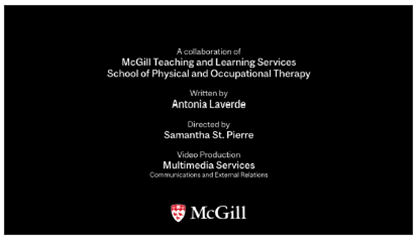
Logo use—Closing slate
 The McGill logo (and its extensions, when applicable) as outlined in The McGill Logo: Space and size should be used for McGill-related videos. Whenever possible, the logo should be placed on a white or black background as seen on the left at the end of each video prior to credits. Logos should be centred on the screen and set no smaller than 300 pixels wide.
Logo and text—Closing credits
 The McGill logo (and its extensions, when applicable), as outlined in The McGill Logo: Space and size, should be set on a white or black background.
Official McGill fonts should be used for closing credit type. In this example, McGill Sans Regular and McGill Sans Medium are used.
Social media
This section covers McGill-branded social media channels.
Avatars / profile icons
It is very important that McGill’s social media channels also project a consistent and coherent look. As such, official social media avatars and high-quality “cover” photography (see Visual System: Use of photography) are required. Please submit a customized avatar request form for your faculty, department or unit. Avatars may be created for Facebook, Instagram, LinkedIn, Twitter and YouTube.
Faculty avatars
![]()
Department avatars
![]()
Vehicles
This section covers McGill-branded vehicles.
Vehicles
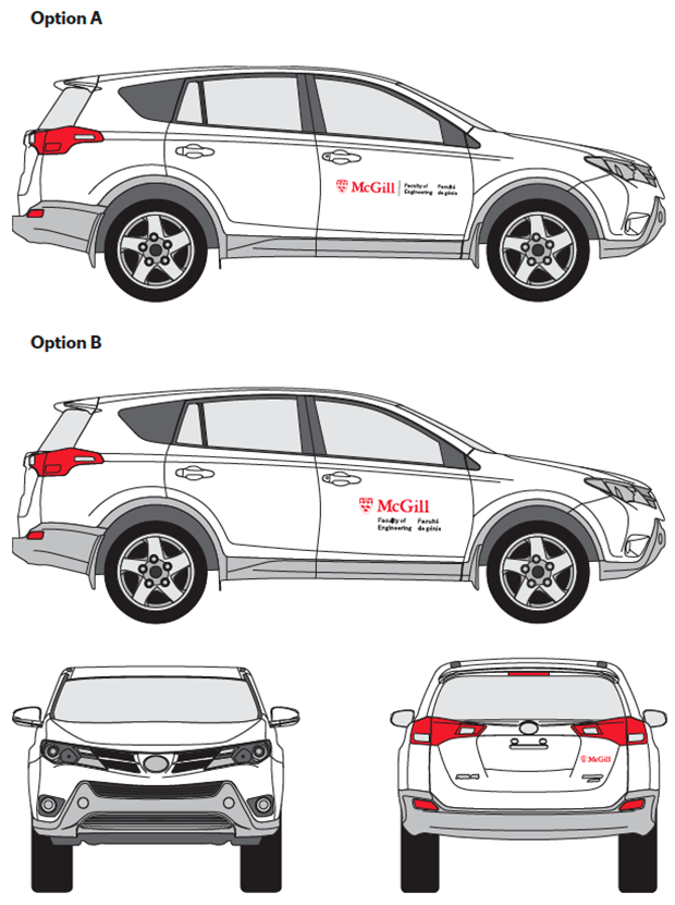
The McGill logo extension (see The McGill Logo: Logo extensions) is used to brand University vehicles. The logo extension is placed on both driver and passenger side doors and the McGill logo should appear on the back. Either option A or B can be chosen but the same option has to be used for both side doors. Please contact Graphic Design for decal production.
AI-generated images
General guidelines for using AI-generated images at McGill University
-
Respect community identity and privacy
- Generative AI tools should not be used to create depictions of individuals, including students, faculty, or staff from McGill University.
- Do not use AI tools to generate images that could misrepresent or bring reputation risk or harm to members of the McGill community or to the University itself.
-
Authenticity, accuracy and integrity
- AI-generated images should not be presented as authentic or real and should be explicitly labeled as "AI-generated".
- Do not create images that misrepresent historical events, academic achievements, or other aspects of university life.
- Campus representation
- Do not use AI tools to create representations of McGill’s campus, buildings, facilities, or landmarks unless such use is explicitly authorized by the University. This ensures an accurate and respectful portrayal of the institution.
- Avoid harmful or inappropriate content
- Do not use generative AI to create images that are offensive, defamatory, or discriminatory. This includes content that perpetuates stereotypes or portrays individuals or groups in a negative light.
- Avoid generating content that violates University policies on inclusivity, harassment, or ethics.
- Copyright and intellectual property
- Ensure that any AI-generated images comply with copyright laws and do not infringe on McGill’s intellectual property, including McGill logos, emblems, graphics and trademarks.
- Ensure that any AI tool used does not create content based on copyrighted works without appropriate permissions.
- Educational transparency
- When using AI-generated images in academic work, disclose their origin and purpose. For example, include a statement like: "This image was created using generative AI software."
- Clearly distinguish between AI-generated content and original or sourced content.
- Limitations and ethical use
- Understand the limitations of AI tools, such as potential biases in generated content, and avoid using them for sensitive or controversial topics without thorough review.
- Do not rely on AI-generated images for critical decision-making, such as research conclusions or event representations.
Resources
A number of resources exist to support the use of these visual identity standards.
Online resources
Logos
The various formats and versions of the McGill logo, along with explanations about which to use when. Download a logo.
Trademark Policy
For students and other third parties wishing to use the McGill logo or other McGill trademarks, consult the ![]() McGill Trademark Policy.
McGill Trademark Policy.
AI-Generated Images
General Guidelines for Using AI-Generated Images at McGill University.
Other policies and guidelines
Policy Relating to the Naming of University Assets.
Fonts
Download McGill’s official typefaces.
For additional resources and templates, please go to Download McGill brand assets.
Services
If you have questions or need support as you design your communications materials, please don’t hesitate to contact the units listed.
The logo and other McGill trademarks
For questions about McGill’s trademarks, contact:
E-mail: logo.communications [at] mcgill.ca
Graphic Design
Contact the Graphic Design unit for all design needs, including questions about templates and logos. Graphic Design is also in charge of creating the campus’ lamp post banners and scheduling installation.
Photos
Contact the Media Relations Office to request photos from the University’s image bank or ask questions about use of photos.
Media Relations Communications and Institutional Relations
James Administration Building, Room 110
845 Sherbrooke Street West
Montreal, Quebec H3A 0G4
Stationery
To obtain business cards, letterhead or other standard stationery, contact Printing Services. For customized stationery needs, contact Graphic Design.
McGill Printing Services 3465 Durocher Street
Montreal, Quebec H2X 0A8
Phone: 514 398-6300
Fax: 514 398-7353
E-mail: printing.services [at] mcgill.ca ( )
Visual identity standards for special logos
There are detailed standards for use of certain special logos. These include
- Athletics and Recreation
- Desautels Faculty of Management
- Schulich School of Music
Visual identity on the web
Contact Digital Communications for information regarding McGill-branded websites.
E-mail: web.communications [at] mcgill.ca
Videos
McGill's Visual Identity and Creative Platform
This video explains how and when the Made by McGill platform is activated and its relationship to McGill's existing Visual Identity.
An Overview of McGill's Visual Identity Guide (Part 1)
This video covers basic information about McGill's logo and details guidelines for correct logo application.
An Overview of McGill's Visual Identity Guide (Part 2)
This video explains McGill’s overall brand architecture, including standard formats for logo extensions. It also shows how to apply McGill logos and extensions to printed and digital stationery.